

 |
About These Maps
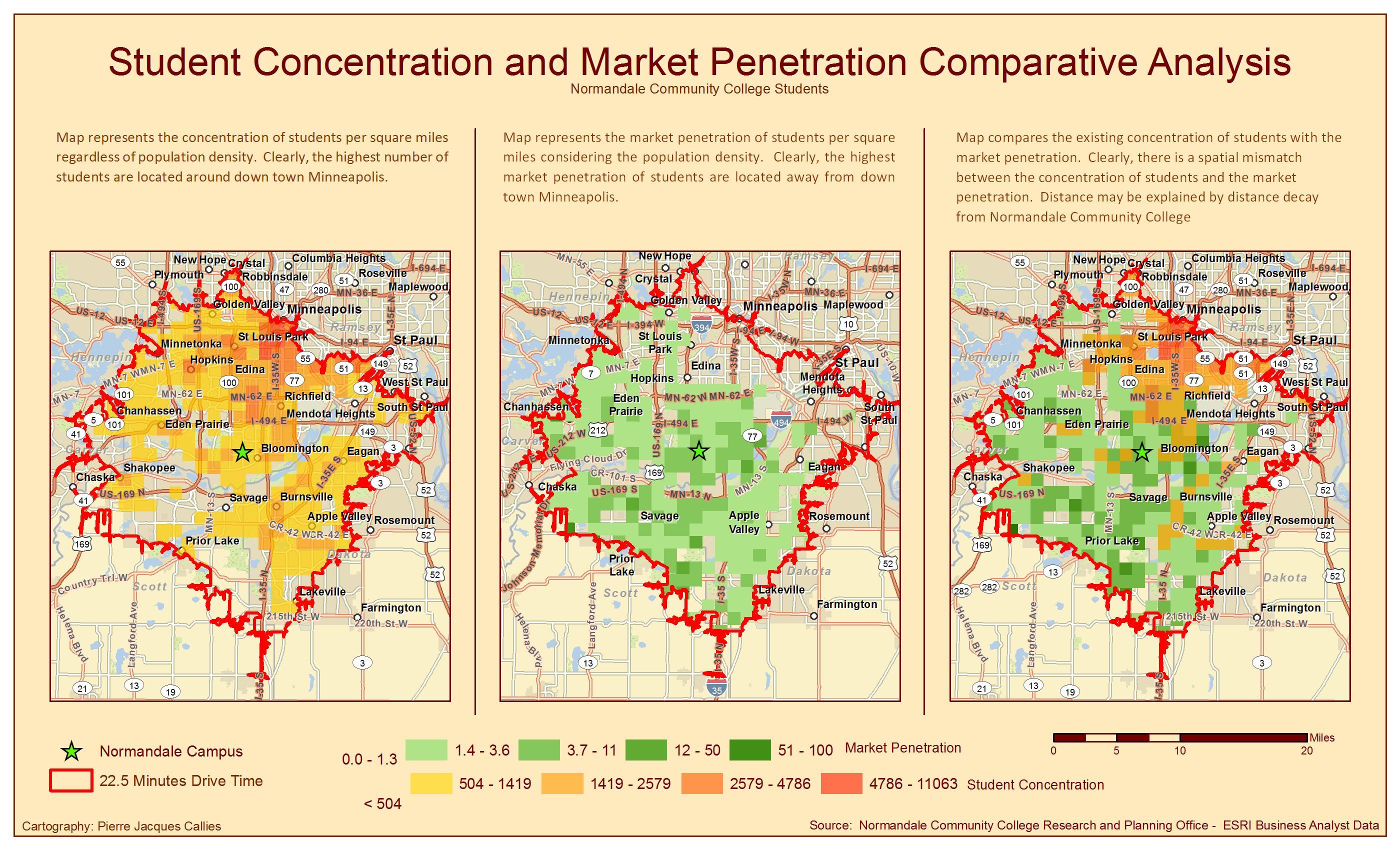
The 3 static maps displayed above show how misleading spatial and hot stop analysis can be.
The left map displays the concentration of over 9,000 Normandale Community College students based on the address they provided. Clearly, the map shows that the highest concentration of students comes from the north east side of the map.
One could, therefore, assume that Normandale is very successful at recruiting students from the north east side of the map. Yet, the left map does not provide any information about market penetration, as it does not take into consideration the population density. It is as if one was asking whether there are more water in Lake Superior than in Lake Minnetonka. The statistical answer is always “yes”, a self fulfilling prophecy.
On the contrary, the center map represents the proportion of students attending Normandale Community College to the total number of potential students. The student density or hotspot analysis shows the exact opposite from the previous map. Clearly, the center map shows that market penetration is far better along I-494, around Normandale, and in the south-western side of the map.
The right map simply combines the findings of the two previous maps to illustrate the differences.
The business implication for Normandale Community Colllege of the two analysis is very important. It may provide valuable information to Normandale recruiting marketing team. More resources might be used to recruit students from the north eastern side of the maps.
Please note, that the research was limited to 22.5 minutes commute radius. Indeed, the average commute of Minnesotan residing in the Twin City Metro area is around 22.5 minutes on one hand. On the other hand, 80% of Normandale Community College provided addresses .
Also note that this project was a graduate class project.